Want to have a specific element show up only for desktop users, and not users on tablets or mobile devices? Perhaps for a specific ad code or custom HTML setup that's only meant for one device.
We have the right tool to facilitate this sort of control over your site, and it's called the Conditional Content element.
By inserting an element you want specific control over inside of the Conditional Content element, you can create different experiences for mobile, tablet, and desktop users.
You can add the Conditional Content element to any part of your layout with the + ADD ELEMENT action in the Layout & Design tool.
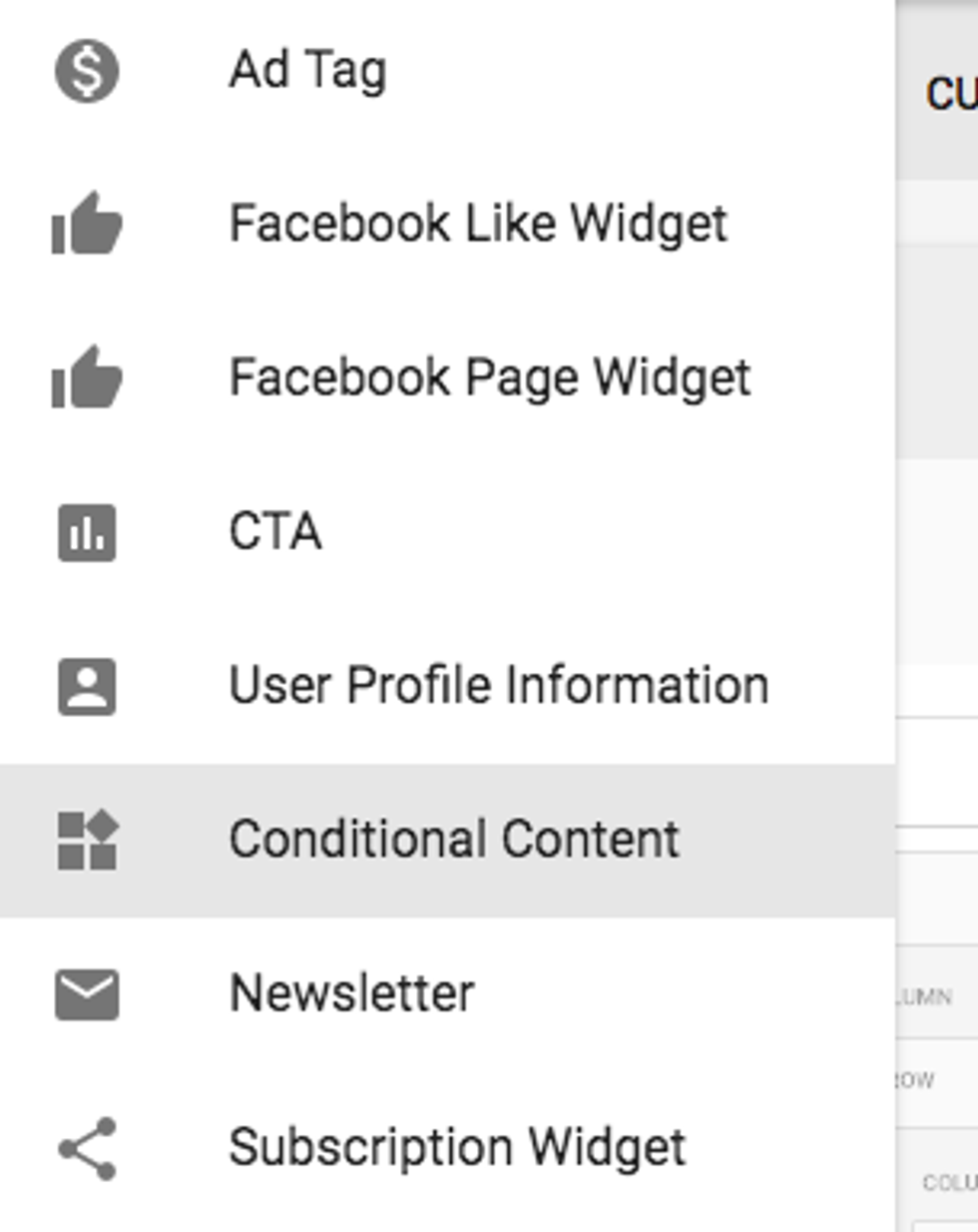
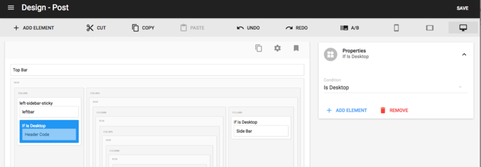
Once the Conditional Content element is inserted, you can place new elements inside of it, such as Header Code.

In the drop-down menu of the Properties card, you can choose if you want the conditional content to be shown in mobile, tablet, or desktop views.
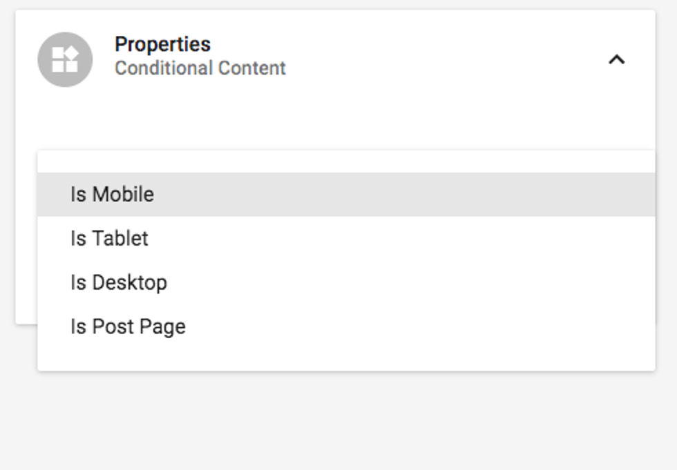
If you choose "Tablet" and you're in desktop view, or "Mobile" and you're in tablet view, and so on, don't worry — the element hasn't disappeared. It's only visible in the viewport when it's called to be displayed.
Bear in mind that if you want an element to display on desktop and tablet, for example, you'll have to create two different Conditional Content elements with the same element inside of each.
On Desktop
On Tablet

On Mobile


