Organize your text with horizontal lines
Horizontal lines help editorial teams build content that is both visually appealing and structurally solid as they break up articles into clear and understandable sections that audiences can easily identify.
Horizontal lines are easy to add and style using our Entry Editor and our Layout & Design tool. From Entry Editor, simply click the Horizontal Line icon in the toolbar and a horizontal demarcation will be placed within your text.
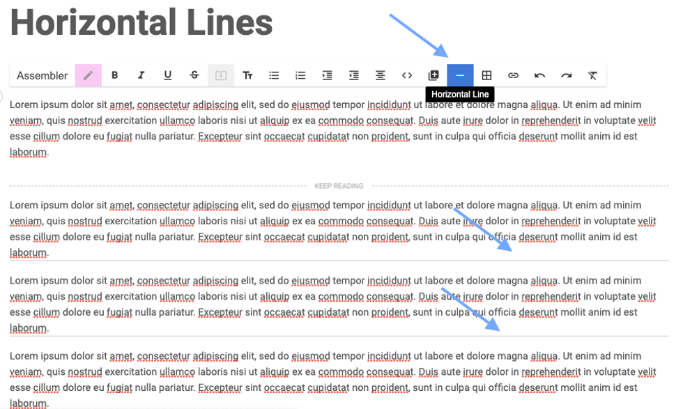
How to Style Horizontal Lines for Articles
If you want to style your horizontal line for a specific look, add the following CSS to your Top Bar element in Layout & Design tool:
.body .horizontal-rule {
      border-top: $Width $Style $Color;
  }
The following example shows a horizontal line styled in red:
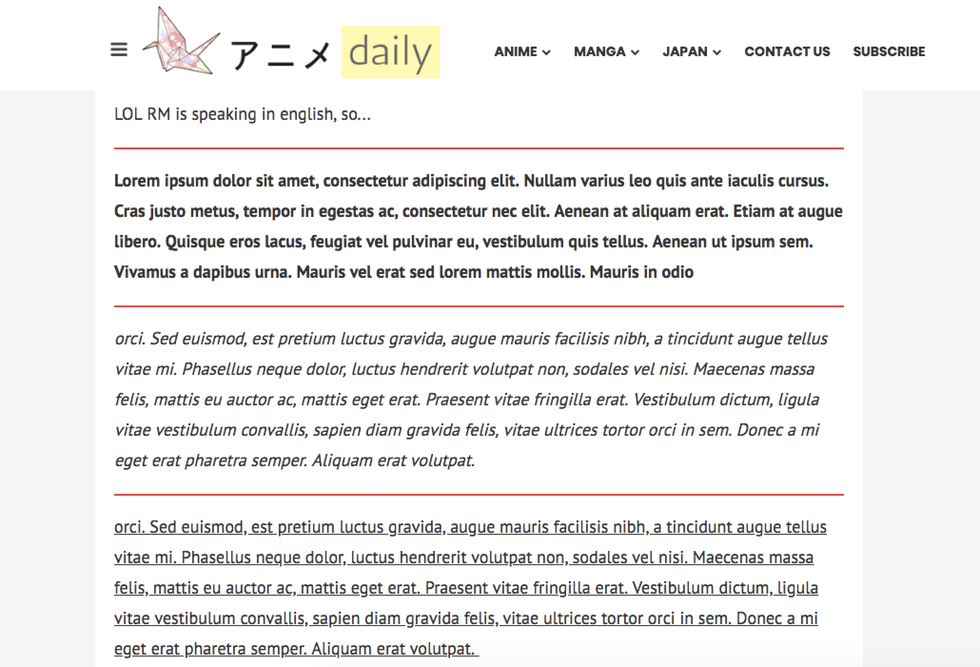
How to Style Horizontal lines for AMP
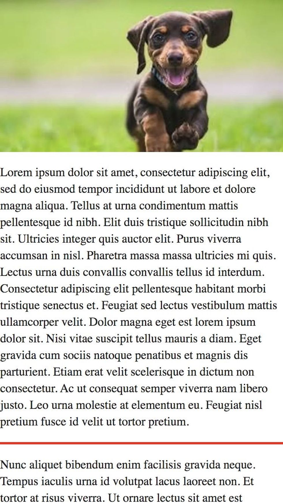
Horizontal lines can also be styled for Google's Mobile Accelerated Pages (AMP) format, although it's important to note that CSS on AMP should be used judiciously because there are strict limits to the amount of styling that's allowed.
To add styling for AMP, the same code snippet called out above in this article should be added to your AMP post page in a Custom HTML element.
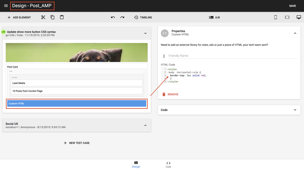
This is an example of how a styled horizontal line looks in a live Google AMP article:
If you have any questions about horizontal lines, email support@rebelmouse.com or contact your account manager today.


