The Layout & Design tool is RebelMouse's intuitive canvas that guides you through creating the perfect look and feel for your website.
The foundation of the Layout & Design tool is made up of rows and columns. The building blocks of your page are made up of Elements, which bring your website to life in different ways. By clicking the + ADD button in the Layout & Design tool's toolbar, you can begin to add, arrange, and customize each element of your site.
Here's an in-depth look at the different elements available to you within the Layout & Design tool.
Rows and Columns
Row: These are horizontal areas that you can combine with columns to define your grid. They can be rearranged by dragging and dropping.
-Tools for Rows
- Use Margins: Select this checkbox if you want margins around your row.
- Use Outer Border: Select this checkbox to place a border on the outer edge of your row.
- Remove default column separation: Removes the default separation between columns.
- Remove default vertical separation: Removes the default vertical separation between columns.
- Columns horizontal separation: Use this slider to change the horizontal separation between columns in the row.
- Columns vertical separation: Use this slider to change the separation between columns in the row.
Column: These are vertical areas that you can combine with rows to define your grid. They can be rearranged by dragging and dropping.
-Tools for Columns
- Desktop Width: Use this slider to change the width of the column.
- Element Vertical Separation: Use this slider to change the separation between Elements in a column.
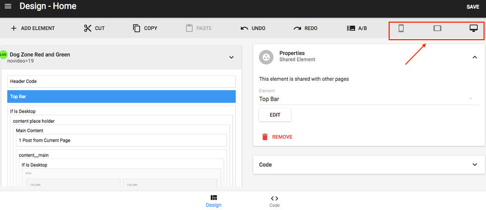
In order to make the arrangement of your columns responsive to mobile screen sizes, make sure to use our easy tool in the upper-right corner. Simply select the desktop, tablet, or mobile symbols to rearrange your layout accordingly.
Layout & Design Elements
You can search for any element by clicking the + ADD ELEMENT button in the top right-hand corner of Layout & Design Tool. From there, you will see a search bar where you can type in your query. Here's a screencast of how it works:
Posts
Use this element to add articles with defined properties to the layout.
Properties of the "post element" that can be changed are:
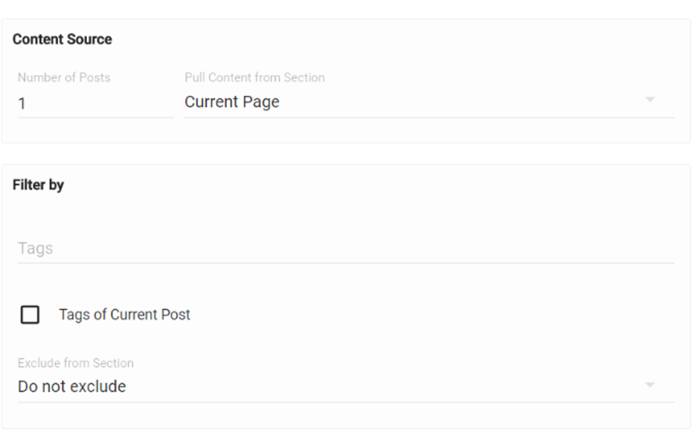
- Number of posts to be displayed: Changes the number of posts displayed in the element block.
- Pull content from section: This brings up a drop-down menu with the following options:
-Current Page
-Most Read
-Related
-All Sections of the Site
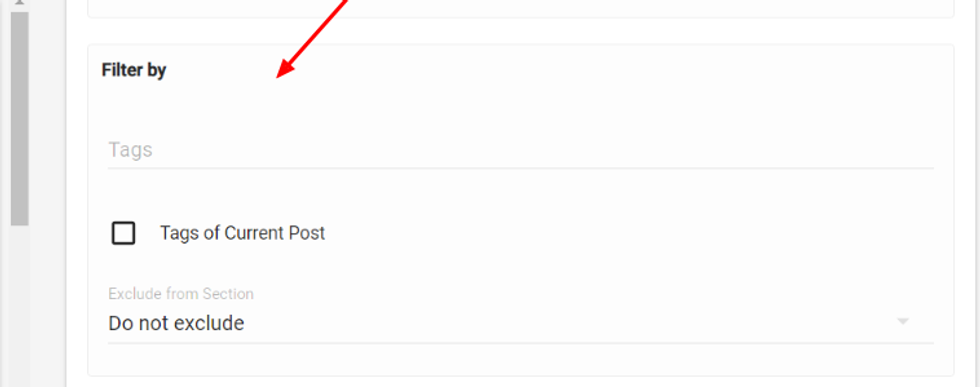
- Filter by tags: You can add desired tags and it will show articles with those respective tags only.
- Exclude by section: If you want to exclude articles from a particular section, you can select the respective section from this drop-down menu.
- Element Order: All the desired elements of the article can be rearranged by just dragging and dropping. You can also change the placement as top/right/left/bottom.
Section: It displays the section of the post.
Headline: It displays the headline of the post
Subheadline: It displays the subheadline of the post.
Author: It displays the creator's name with their profile picture. It also include details about more than one author.
Date: It shows the post creation date.
Photo credit: It shows the source of the lead media image.
Post body: It displays the article body.
Post Shares: It shows number of times the post has been shared to social media.
Badges: It displays badges given to the article.
Sponsored Badges: It displays sponsored badges given to the article. A badge has a link that redirects users to different sites.
Snark Line: This is an alternative text that you can display for the post.
Page views: It shows the number of times the post has been viewed.
Follow button: Lets a user follow or unfollow the article.
Community comments: All community users can submit comments to the article via the comment block.
Like button: Adds a Facebook "like" button to the article.
Source link: If the article has an external source link, it can be shown here.
Add to collection button: When the right settings are enabled, we allow you to "collect" articles as a user, which are then added to your profile and categorized into sections. Please talk to your account manager if you're interested in this feature.
Tags: Tags given to the post are displayed.
Primary Tag: The primary tag of the post is displayed.
Main Author: This displays the creator's name along with their profile picture.
Custom Field: This displays the value for any custom text field added to the Entry Editor. For example, You can add read time to your post using a custom field.
- Spacing: Vertical and horizontal separation between posts and the image column width can be adjusted.
- Image Ratio: Default and individual device aspect ratios for an image can be chosen.
- Columns of Story: This is a drop-down menu with 1–4 options that let you choose how many columns are displayed in the post element. This property is only available for desktop.
- Show Video When Available checkbox: If checked, this will display a lead media video.
- More posts loading: Choose to have the "load more" button to load more posts, or trigger upon scroll.
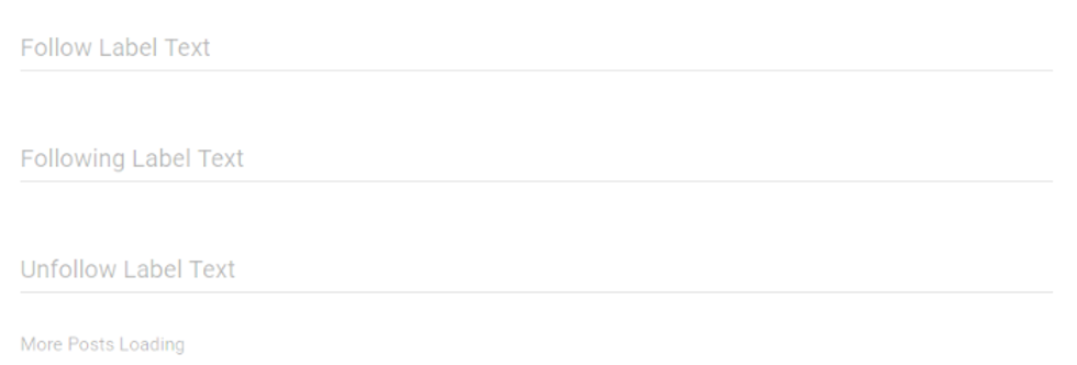
- Follow/following/unfollow text fields: If you have the follow button element activated in the element order, then you can change the labels of the buttons.
- Show as Carousel checkbox: Check this to show the article in a carousel format.
- Show SEO articles Around the Web checkbox: If checked, it will show web links chosen in the editor.
- Allow Duplicates checkbox: If checked, it will allow duplicate posts on the same page. This is preferably always left unchecked.
- Custom Container Class: Custom class name text field gives a separate selector to the post which helps to customize specific block of posts with desired changes to the widget without any impact on other site articles. It's used for redesigning without altering the template design.
For example, if we add the class name design_change and we want to change the headline of that post, then we can add the custom CSS .design_change.widget;headline{color:red} to it. Now the headlines of posts with the custom class name design_change will change to red without altering anything in the default design template.
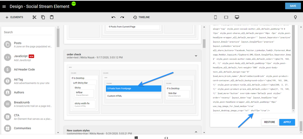
Post Shuffle Option: The Post Shuffle Option will display a new article on your site's front page every time a user refreshes. To enable this function, you must add the following attribute in the Post Element's code mode:
<post> element shuffle="true"
Here's how the setup looks in Layout & Design Tool:
And here's how the feature performs on a live site:
The Post Shuffle Option will only work when the Source is set as "Frontpage," and it's not supported for AMP.
Heading
This is a text field element that can be used to create a headline for any block of posts.
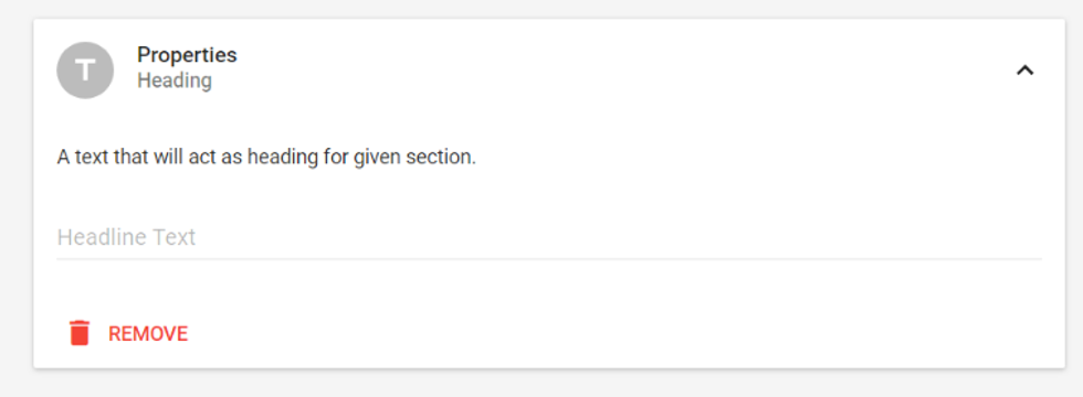
Text: Desired text and a corresponding link can be added using this element.
Formatted text: The formatting tool is available for regular text.

We recommend using the text element when you want to redirect users to different URLs/pages and formatted text.
Custom HTML
With this element, you can customize HTML code for styling different elements of the site.
Post content: This is used when you want to alter the design of the article page.
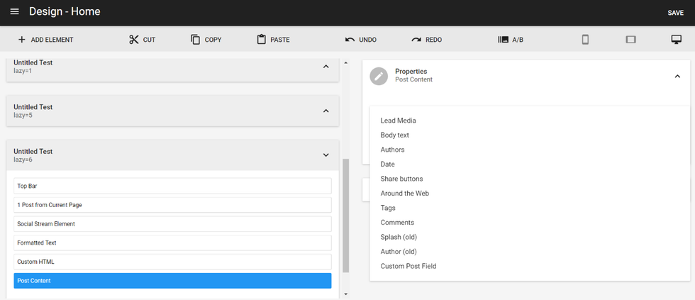
Post Content Element
This element includes basics segments of an article, such as lead media, etc.
Lead Media
You insert it by choosing the Post Content element, and then selecting Lead Media.
- Element Order: Same as a post element.
- Image column width: You can drag this slider to adjust the width of images. The default value is 20px.
- Default Image aspect ratio: Same as a post element.
- Per device aspect ratio: Same as a post element.
- Load more from section brick: Same as a post element.
- Show SEO articles around the web: The article links related to the post are displayed.

Body Text
Another Post Content element.
- Pagination Break Every: Allows you to set up when a pagination break occurs after a certain number of posts.
- Pagination Break in this order: Allows you to set up the order of your pagination breaks.
- Ads Break Every: Allows you to set up up how often an ad shows up in between posts.
- Ads Break in this order: Allows you to set up the order of the ads to be displayed.
- Number the particle in the list: You can number the particles in ascending or descending order.
- Body Text: You can choose whether you want body text to be placed above or below media.
- Assembler Pagination position: We can select where we need to place the pagination number for Assembler. For example, top/bottom/right/left.
- Prev page button text: You can give a label to the previous button of the pagination controls.
- Next page button text: You can give a label to the next button of the pagination controls.
- First page button text: You can give a label to the first page button of the pagination controls.
- Hide next story button: If unchecked, it shows the next story button, which is used to navigate to another story.
- Next story button text: You can give a label to the next story button of the pagination controls.
- Show full post body: If checked, by default it will show the entire post body's content.
- Show more button caption: You can give a label to the Show more button of the pagination controls. This expands the post body to allow a user to read further.
- Show less button caption: You can give a label to the Show less button of the pagination controls. This contracts the post body.
- Update post URL on post view: This keeps updating the URL with the current post being viewed by the user.
Authors
Another Post Content element. Use this element to display different kinds of authors. You can set the maximum number of authors, select the author type, and change the order.
Date
Another Post Content element. Shows the post's published date.
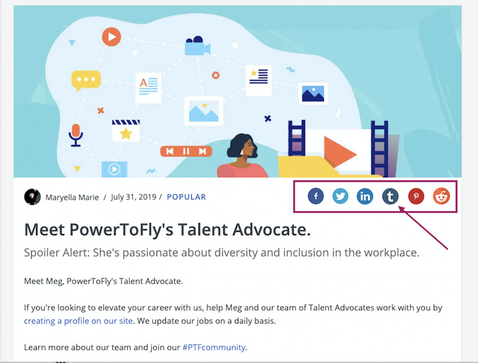
Share Buttons
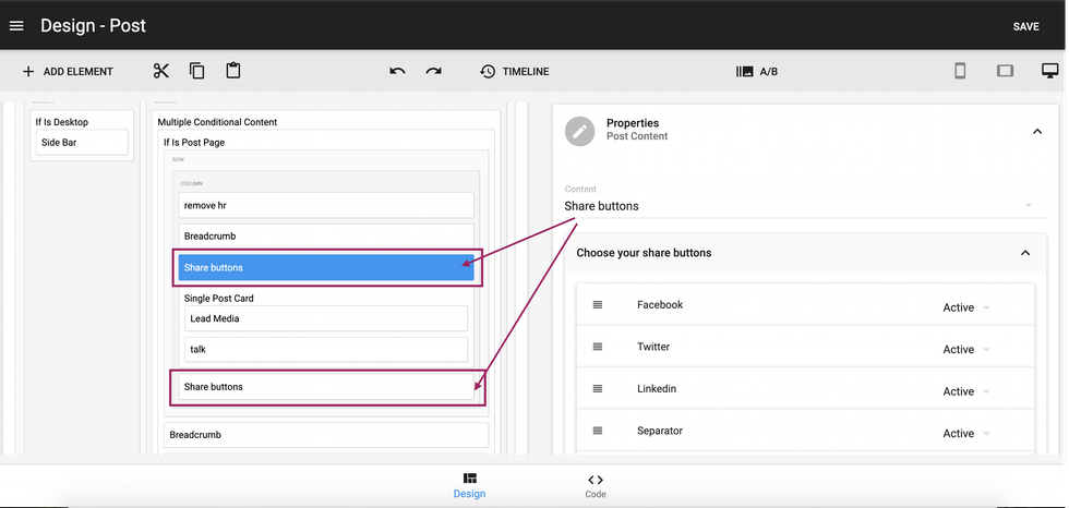
Another Post Content element. We can activate/deactivate different social share buttons.
For example, you can add the Share Buttons more than once to a single page by adding this element repeatedly where you want the icons to be displayed.
Around the Web
Another Post Content element. Related articles around the web are displayed. You can change the tile text.
Tags
Another Post Content element. All the tags associated with the post are shown.
Comments
Another Post Content element. A Community Comment block is displayed. You can hide this block by checking the hide comment block.
Splash (old)
Another Post Content element. This is the Lead Media element's image or video — the isolated version. We recommend only using it when you need a specific setup that requires separating the Lead Media element from the rest of the post's content items.
Author (old)
Another Post Content element. This is the author of the article — the isolated version. We recommend only using it when you need a specific setup that requires separating the author and their avatar and bio from the rest of the post's content items.
Custom Post Field
You can select the custom field from the available drop-down menu.
Shared Element
These are elements that are shared across other pages (e.g., Top Bar, Side Bar, or Footer).
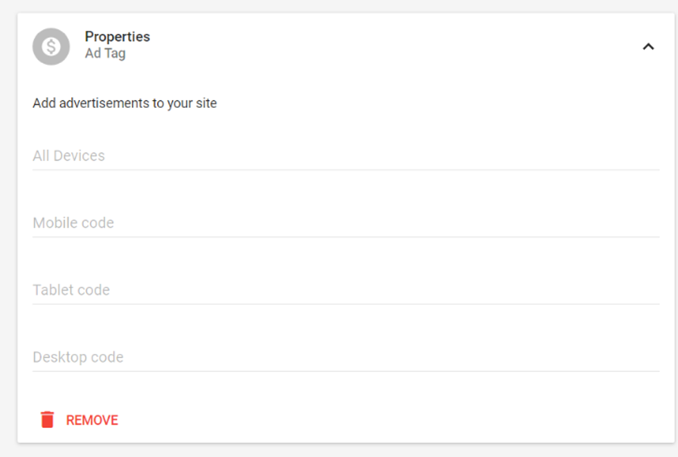
Ad Tag
Advertisement codes can be added here for each device.
Facebook like Widget
This adds a Facebook like/share button.
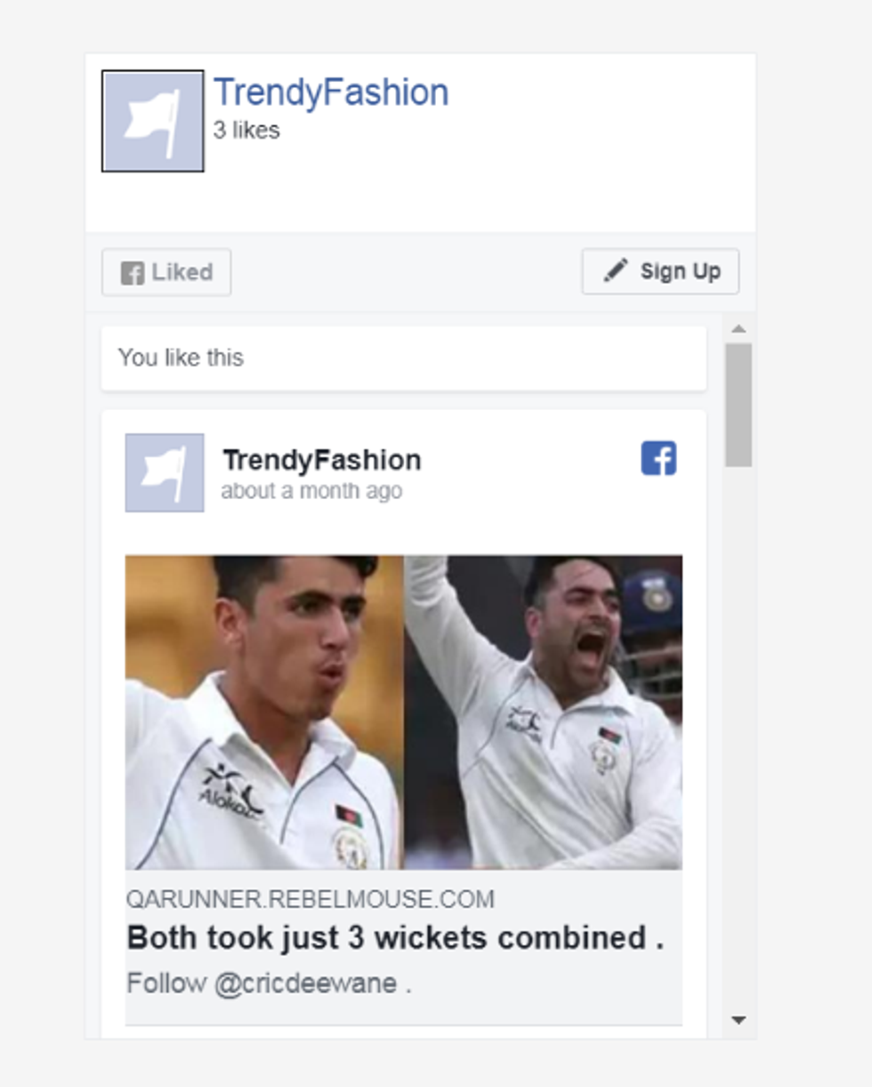
Facebook Page Widget
This adds a Facebook Page block.
CTA
A CTA block is added.
User Profile Information
Use this to add profile details of any user by adding simple HTML code.
Conditional Content and Multiple Conditional Content
Use these elements to specify how content should be displayed based on what device is being used (desktop vs. mobile vs. tablet).
Subscription Widget
It's a widget where we can include newsletter and social links elements.
Newsletter
The newsletter element adds an email field and subscribe button. We can redirect users to our social accounts using social links.
Link List
This element includes links and section links.
Image
Image can be added and reused throughout the Layout & Design tool.
Ad Header Code/Header Code: Custom HTML Code Field
Appends code to the <head> tag.
Element Wrapper
More than one element can be clubbed together to acquire a desired design.
Sticky
Remains on the screen on scroll.
Menu Button
A hamburger-menu button that's used for site navigation.
Search Box
This adds an input-text field with a search button.
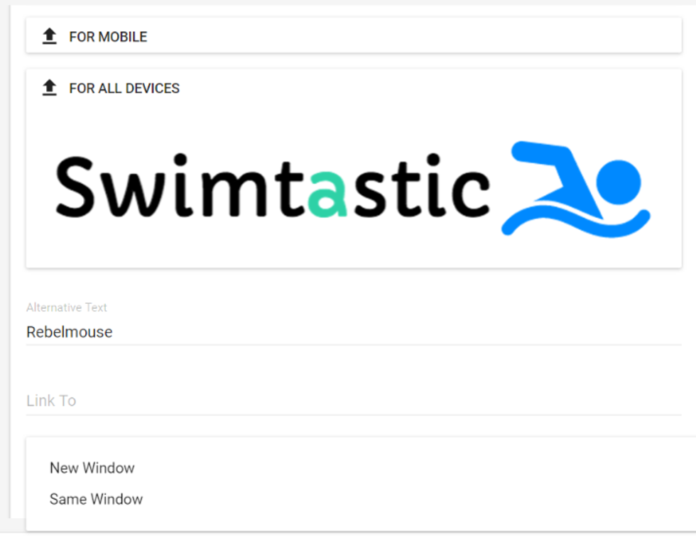
Logo
A logo image can be uploaded for all devices. It can be associated with link and alternate text. There is an option to open the link in a new window or the same window.
Show On Scroll
Element remains on the screen even while scrolling.
Lazy Load
Here you can choose an element that should be delayed so that other important content on the page loads quickly.

Random Pick
Other elements can be nested inside random pick, and those will be randomly displayed on the front end when refreshed by the user.
For example, if you have a post element and newsletter widget inside of a random pick element on the home page, then it will display an article for the first visit to the home page, and it will display a subscription newsletter upon refresh.
Manage Sections
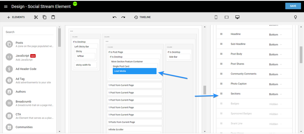
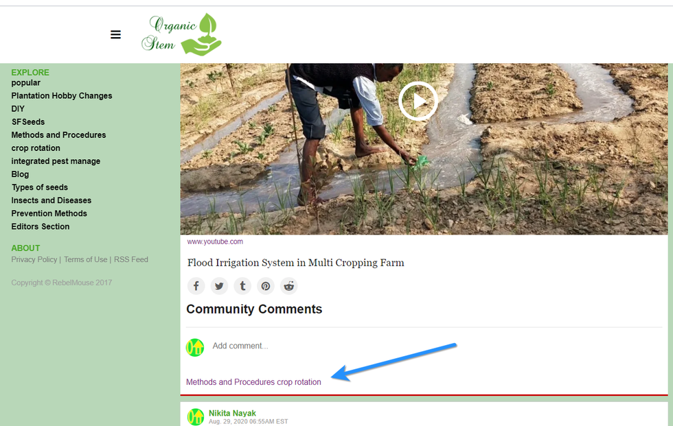
You can also treat sections like a reorderable element, just like you can for headlines, subheadlines, photo captions, etc. This works for the Post element and lead media. Simply click and hold the hamburger icon (☰) to the left of the Sections element to drag and drop where you would like it to appear.
Here's an example of what this looks like live on site:
Variable Override
New OG: Tags for any page can be given using a variable override.
Here's how it works:
For example, you can use a new OG:image that overrides the image that was being shared to Facebook on the home page.
So instead of showing the site's logo, it will show a completely different image.
GDPR Cookie: Use this element to set up a GDPR-compliant cookie on your site.
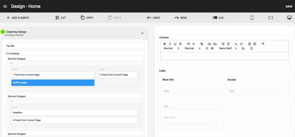
Properties of the GDPR cookie:
- Description: You can add a text message, such as, "Our site uses cookies to improve your browsing experience."
- Links: User can provide a link to their privacy policy here, which can then give more details about the cookies being used on the site.
- Accept text button: It's necessary to be compliant about notifying users about a site's cookie usage, so that's why there's an accept button which is just plain text that can say "OK" or otherwise.
If users don't want their cookies tracked, they can turn around and exit the site instead.
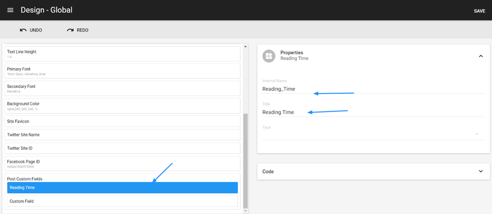
-Post Custom Fields: This is defined in global settings. A custom field element can be used to allow you to capture desired text in a field of Entry Editor.
For example, if you want to add a read time field to the Entry Editor, you can simple add a custom element in the post custom field.
If you have questions about the Layout & Design Tool, email support@rebelmouse.com or talk to your account manager today.


