Everything is about the feed right now because that's where your audience lives. The comfort of scrolling through articles, news, posts, and videos has taken over social media, and we're not letting that ship sail without getting on it.
Meet RebelMouse's Social UX for Media Layout
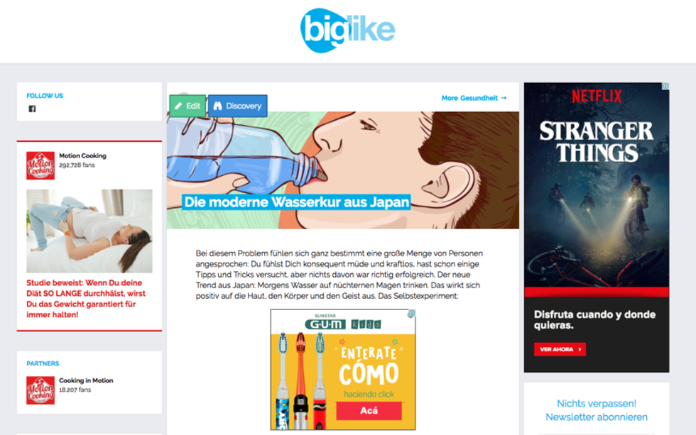
Let's break down its key features:
"Keep reading..."
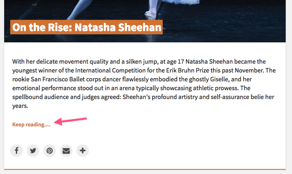
Just like Facebook, we wanted to give users the option to show either a snippet of their content or the entire post. Improving the reading experience is part of the heart of this layout.
Share Quickly to Social with These Handy Buttons
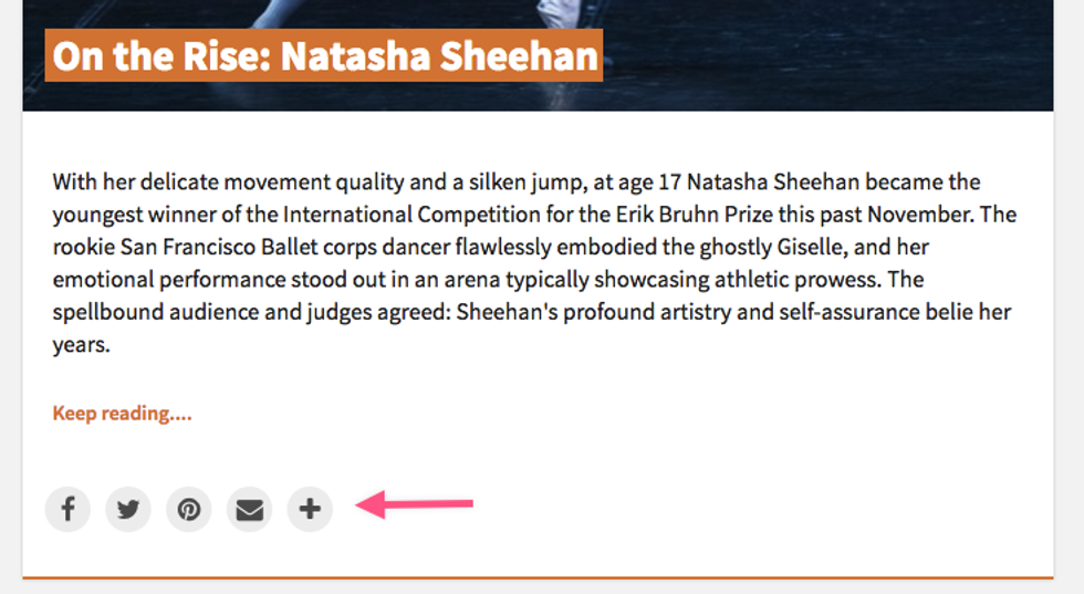
There's no need to go inside the actual article to share it to social. You can now quickly share content via the buttons at the bottom of each card for a seamless, easy process.
URL Changes on Scroll
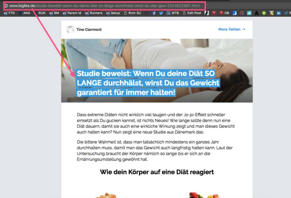
As you scroll down the Social UX for Media layout, the URL in the address bar changes with each new post that moves onto the screen. Each URL change counts as a page view.
More Content

On the top-right of each post's card, you'll see the text "More [tag] →." The [tag], defined by you, indicates that a piece of content belongs to a section. If you click on the link, you'll be taken to a section that contains all of the articles that have been categorized under it. In the screenshot example above, the link would be "More Dancers & Companies → ."
For more information on how to better monetize your content and take advantage of our Social UX for Media layout, click here .


